An Italian artist Marco Fontana became popular with his comic books, where he “writes letters and sings with a brush”. This is a kind of skill that requires knowledge of anatomy, light and shadow, architecture and many other things, all of them working for the same purpose – to tell the story. “I mix everything together and try to get the most pleasure out of the work,” the comic author says.
He draws illustrations for magazines and books, develops logos and appearance of different characters, and recently cooperates with Tecnografica Italian Wallcoverings. Marco Fontana told BATIMAT RUSSIA how he happened to work in this project and how to combine accent wallpapers with other textures.
1. The wallpaper designed with your participation may be called a work of art. Are you satisfied with cooperation with the famous Italian wallpaper manufacturer?
My cooperation with Tecnografica Italian Wallcoverings began in 2015. I practiced collaborations before, so it was easy to find common ground with a new partner. I am satisfied with our work. We joined forces to create panel wallpapers with my images. My style of making up plots comes from comics: I use markers, Indian ink and watercolor in order to consider any detail, which is very important when designing original wallpaper.
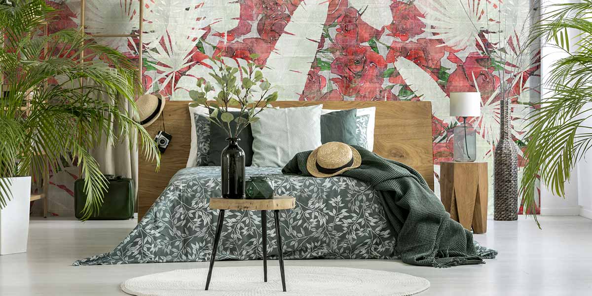
I can create small drawings and reproduce them in excellent quality on large formats. In such wallpapers as City Of Love or Fitzcarraldo the increase in size does not affect lines and color transitions. On the contrary, the final effect is enhanced by the illusion of freshness and even greater depth. And unusual, adorable wallpaper textures allow to get new technologies in production.
2. Can you identify fashion trends in wallpaper design for 2019, color solutions and prints?
If we draw an analogy with painting, then wall coverings are used as a background to “paint” an interior plot. In other words, it is the chosen wallpaper that sets tone for the whole interior. Therefore, in addition to macro trends imposed by fashion I am increasingly convinced that a real “new trend” will be the ability to offer and create individual products with subsequent quality service. Nevertheless, I believe that in 2019, the desire to bring nature to our homes is still actual. Therefore, on the one hand, I expect the redundancy of brightly colored floral motifs of the oriental style, exotic plants and animals. On the other hand, imitation of natural materials with muted decor in Scandinavian style will remain on trend.
3. What is the main criterion when choosing an accent wall? How to combine accent wallpaper with companions, monophonic wallpaper and other textures?
The main criterion is location. The distance should provide a good overview. The wall opposing the entrance to the room is usually accentuated. The accent wall can also be located behind a functional area, a group of furniture, for example, at a dining table, a sofa with a chair, a workstation that stands out even more against the background of the corresponding wallpaper. The accent wall often has a brighter and more saturated color, a larger pattern comparing to others. However, a common element should be found: a common shade or a similar pattern.
A huge number of options for wall finishing is offered today. Bathroom is a special room with specific microclimate, which is characterized by high humidity and significant temperature changes. Therefore, when decorating a bathroom, many people choose ceramic tiles. However, wallpapers that are not afraid of water and fire make a good alternative.
Actually, wallpaper became the main decorative element combining with modern coatings: ceramic granite, mosaic, decorative plaster, wood, marble and other materials.
Artistic wallpaper, which usually has very specific and decorative drawings, can be combined with other textures, as well as with other wallpapers, thanks to its individuality. Now I’m working on creating a special collection of wallpapers for Tecnografica Italian Wallcoverings, designed to cover the walls in all areas of living space.
4. What trendy color solutions do you recommend to use?
As in the casino, I bet on dark red. Color perception is completely subjective. In early December, the Pantone Color Institute traditionally defines the main color of the year. In 2018 it was ultraviolet – actually, the color that we are just beginning to see now – September 2018 – on clothes and furniture. In 2017, everyone said that “there is no more fashionable color than green”, which instead was used in a mixture with gray, blue and other natural shades. Green color, or rather greenery, also stood out, but it is obvious that even the most stubborn designer will surrender when media are insisting for several months.
Following these forecasts, dark red will, of course, be the principal character of 2019. And bright pink. And bright orange. And white swan. And colors of the earth...
I must admit that I am faithful to my beloved black-and-white and gray, which I use to mix with colors I need. All the colors of 2019 will surely be among them.
You can see the works of Marco Fontana at BATIMAT RUSSIA 2019 from 12 to 15 March in the Crocus Expo IEC. Don’t miss it!


